CSS 学习笔记
学习网站:
all
使用这个属性可以快速的将一个元素的样式清空。
button {
   all: unset
}
这个 button 元素的样式就会完全清空了。
animation-play-state
使用这个属性可以控制 CSS 动画的播放状态。
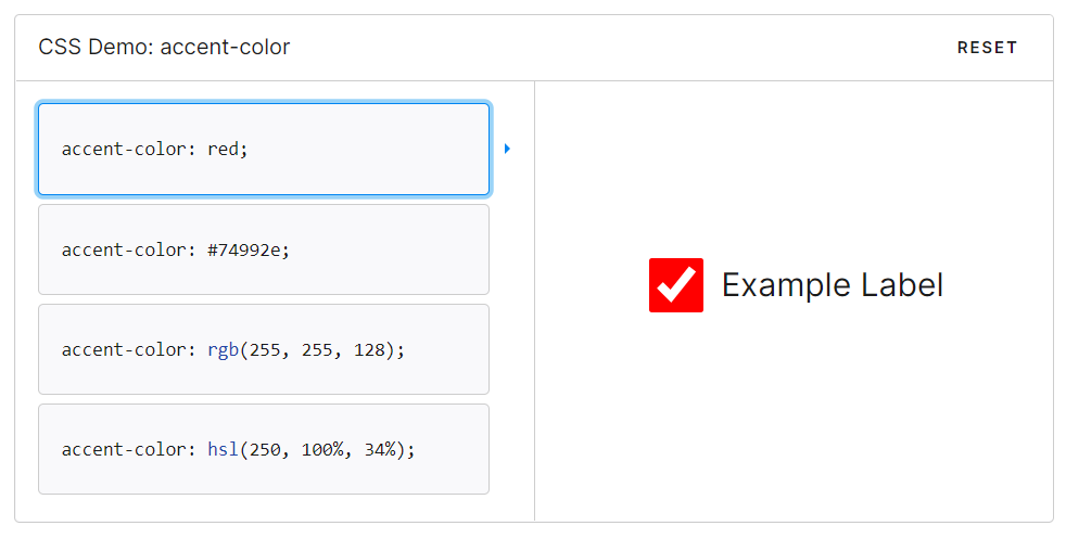
accent-color
可以使用这个属性来覆盖 checkbox 等元素默认的颜色。
Flex
1. Flex
Grid
Grid by Example 学习 CSS 网格布局时需要的一切。
1. gird creation
Info :
创建网格时,必须首先设置 display:grid 。要创建每个宽度为 150 像素的 3 列,请设置 grid-template-columns:150px 150px 150px 。
Property:
grid-template-cloumnsgrid-template-rowsgrid-gap: 8px 10px在行之间提供 8px 的间隙,在列之间提供 10px 的间隙。但为了防止溢出,通常在定义 grid-template-cloums 和 grid-template-rows 使用分数单位
fr。Reference:尤斯托德 (euismod.dev)
Task:
创建一个 2x3 网格,其中每行的高度为 133 像素,每个列的宽度为 50%。
·Answer:
HTML
<div class="container">
  <div class="box"></div>
  <div class="box"></div>
  <div class="box"></div>
  <div class="box"></div>
  <div class="box"></div>
  <div class="box"></div>
</div>
CSS
.container {
  display: grid;
  grid-template-columns: 50% 50%;
  grid-template-rows: 133px 133px 133px;
}
2. gird-area
Task:
Recreate the grid below using grid areas. The sidebar should be 1/3 of the width with the main content taking up the rest of the space.
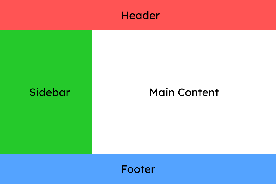
Answer:
HTML
<div class="container">
  <div class="header">Header</div>
  <div class="sidebar">Sidebar</div>
  <div class="main-content">Main Content</div>
  <div class="footer">Footer</div>
</div>
CSS
.container {
  display: grid;
  grid-template-columns: 33.333% 66.666%;
  grid-template-rows: 10% 80% 10%;
  grid-template-areas:
    'h h h'
    's m m'
    'f f f';
}
.header {
  background: #ff5454;
  grid-area: h;
}
.sidebar {
  background: #61cc9e;
  grid-area: s;
}
.main-content {
  background: #ffffff;
  grid-area: m;
}
.footer {
  background: #54a3ff;
  grid-area: f;
}
[]: https://www.euismod.dev/#/learn/3 "euismod grid-area 教学" []: Desktop/source/html/Coding_Starting_up/Grid "本地 CSS Grid.html"
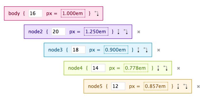
·em and rem
·link and @import
·变量
·Image:cover contain auto
·box-shadow 给盒子添加阴影
box-shadow 属性用来给元素添加阴影,该属性值是由逗号分隔的一个或多个阴影列表。
box-shadow 属性的阴影依次由下面这些值描述:
offset-x阴影的水平偏移量;offset-y阴影的垂直偏移量;blur-radius模糊半径;spread-radius阴影扩展半径;color
其中 blur-radius 和 spread-radius 是可选的。
可以通过逗号分隔每个 box-shadow 元素的属性来添加多个 box-shadow。
box-shadow: 0 10px 20px rgba(0, 0, 0, 0.19), 0 6px 6px rgba(0, 0, 0, 0.23);
创意
· 绘制心形
把屏幕里的元素变成心形。 在 heart::after 选择器里,把 background-color 改成 pink,把 border-radius 改成 50%。
接下来,用类选择器选取 class 为 heart(只是 heart)的元素,为它添加 transform 属性。 使用 rotate() 函数并设置角度为 -45 度。
最后,在 heart::before 选择器里面,设置 content 属性值为空字符串。
<style>
  .heart {
    position: absolute;
    margin: auto;
    top: 0;
    right: 0;
    bottom: 0;
    left: 0;
    background-color: pink;
    height: 50px;
    width: 50px;
    transform: rotate(-45deg);
  }
  .heart::after {
    background-color: pink;
    content: "";
    border-radius: 50%;
    position: absolute;
    width: 50px;
    height: 50px;
    top: 0px;
    left: 25px;
  }
  .heart::before {
    content:"";
    background-color: pink;
    border-radius: 50%;
    position: absolute;
    width: 50px;
    height: 50px;
    top: -25px;
    left: 0px;
  }
</style>
<div class="heart"></div>
· 利用渐变绘制加号
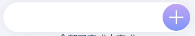
.input-add .plus {
  display: block;
  width: 100%;
  height: 100%;
  background: linear-gradient(#fff, #fff), linear-gradient(#fff, #fff); //❗
  background-size: 50% 2px, 2px 50%; // ❗
  background-repeat: no-repeat;
  background-position: center;
}